Bradesco
Insurance
Insurance platform redesign

Building an uncomplicated concept
Bradesco is a bank and one of Brazil's largest insurance providers, serving millions of customers across life, health, auto, home, and health insurance products.
Department
Insurance
Team structure
Senior UX Designer (me)
Senior UX Research
Junior UX Research
Project duration
13 weeks/2023
Executive Summary
Situation
Bradesco wanted to redesign its insurance claims experience, a critical service used during highly sensitive moments such as accidents, illness, and unemployment. The existing platform suffered from fragmented journeys, complex terminology, and usability issues that increased customer effort and reliance on support channels.
Initiative
Working alongside two researchers, I led discovery activities including stakeholder interviews, customer research, journey mapping workshops, and heuristic evaluations. These insights informed the redesign of the end-to-end claims journey, focusing on clarity, accessibility, and emotional support during stressful life events.
Impact
Contributed to a platform that helped drive 40% year-over-year growth in digital adoption
Supported growth from 1.5M to 3.4M insurance policies purchased through digital channels
Research and design principles were later expanded to auto, home, and health insurance products
The platform now serves 1M+ monthly users
Enabled a fully digital experience, eliminating the need for phone-based claim support
Product walkthrough
Problems
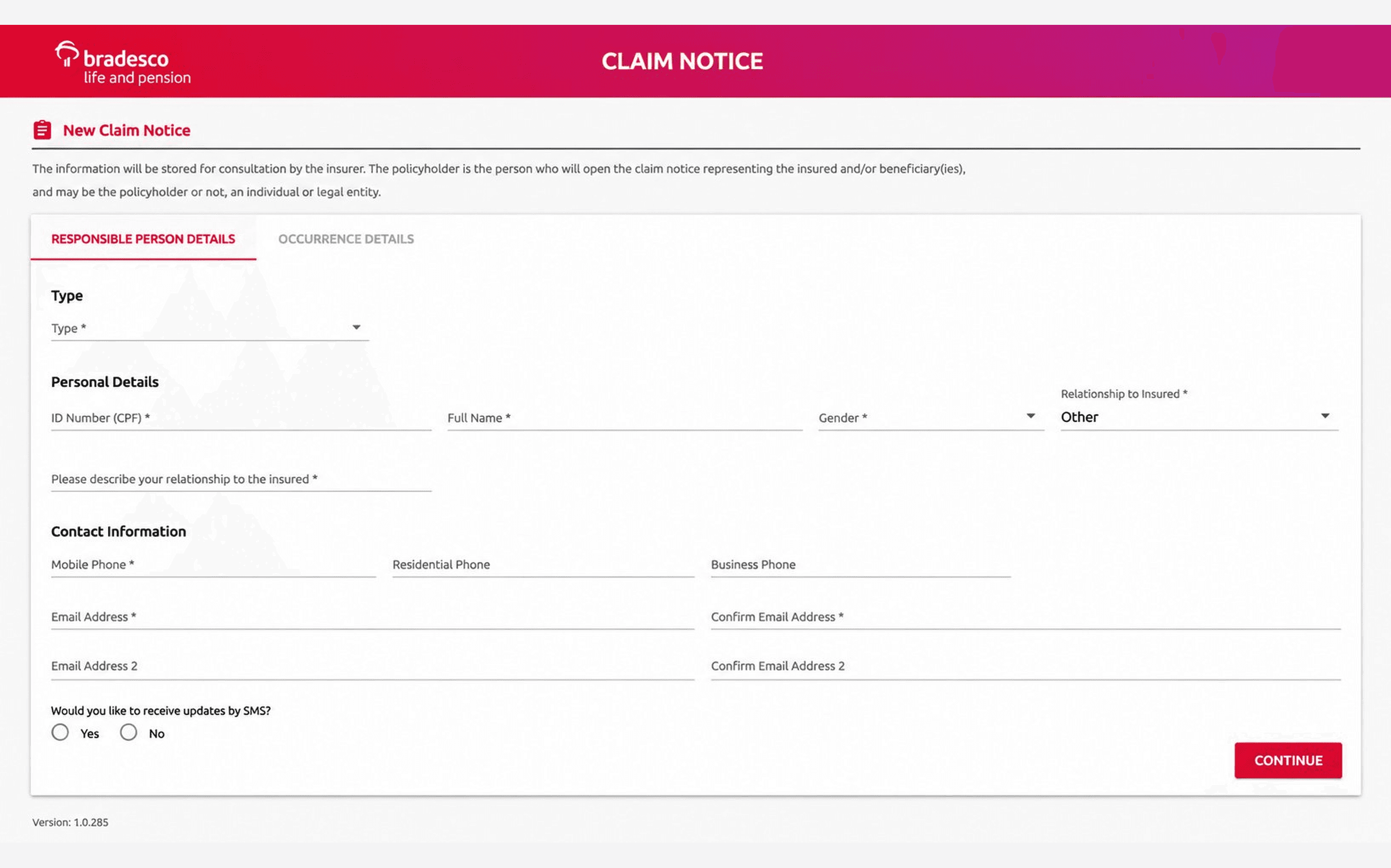
Users who did not understand their role in the claim filing process did not know which document was being requested—whether it was from the requester or the insured.
Solutions
At the beginning of the request to open the ticket, some questions are asked so that communication is as clear as possible and directed to the right user's profile at all times.
Before
After

Before
After


Deep project phases
Research
Journey
Design
What was done

Start
Insurance market research and trends

Research
Competitor benchmarking

Analysis
Heuristic analysis of the current web platform
Analysis
of platform communications

Interviews
In-depth interviews
Insurance market research and trends
To initially understand the business, we carried out a research process with immersion in the exploratory theme and secondary data (information already published and available). We found topics such as the insurance and life market, national and international trends, good UX practices, and good communication practices. We analyzed 5 competitors focused on capturing life insurance claims, thus being able to identify common practices in each phase.
We identified some patterns in the analyzed competitors, which are:
Process before opening the ticket
Competitors made the necessary documents clear before opening the ticket
More than one channel available for opening the ticket (website, app and telephone)
Sending documents completely digitally, no need to go in person
Most of the process is monitored over the phone after the ticket is opened
Analysis with Nielsen Heuristics
We navigate through the current platform, simulating submitting a claim, sending documents and monitoring status just as a user would do. The objective was to identify the positive points and areas for improvement in each of the screens and analyze them according to Nielsen's 10 Heuristics. Next, we bring the points of attention raised by this analysis, which supported the formulation of interview scripts with real users.
Heuristic Analysis allowed us to see important starting points for building the interview guide.
Very technical language,
distant from everyday life, which can mislead the user;
Few instructions and contextualization before an action is performed, the guidance needs to be very visible so that the user can complete the process;
Platform navigation is not that intuitive, it could function as a timeline, in which users were guided to perform one step after another without having to explore alone;
Small fonts and little contrast may impair usability for people with accessibility needs or little familiarity with technology;
The platform's feedback could be more instructive for the user. He needs to be guided about any error he made in the request, and how he can reverse it;
There is no Help area
where users can ask quick questions. Even if he doesn't access this area, it works as a safety net during the process;
Lack of standardization in the terms used and colors in status tracking;
The system does not provide progress status of the request, which stage the user is at and how many are left to complete the request.
In-depth interviews
One of the steps planned in this project includes interviews with 13 internal stakeholders from different areas of the company and a subsequent analysis, 20 Bradesco customers and 5 competitor customers. The question guide was created based on previously carried out research. Based on the interviews, we were able to highlight important points for the future construction of personas.
Stakeholders seek a 100% digital experience. Users want uncomplicated and human language.
Based on the interviews, we constructed two personas. We realized that many of the interviewees are analog, lacking in knowledge, and end up asking for help at the time of the request, which ends up being highly sensitive for the user. Technical language and decentralized information end up complicating the process, even for those already accustomed to using the internet.
Supported by our personas, we developed user journey maps that proved to be extremely useful in initial discussions and during feature development.
From the journeys we find opportunities, frictions, values, insights and points of attention. As this project was short-lived, it was essential to involve as many different interested professionals as possible. Therefore, we met to understand how the data collected could contribute to the construction of the flows to be created. This is how we create the ideal journey.
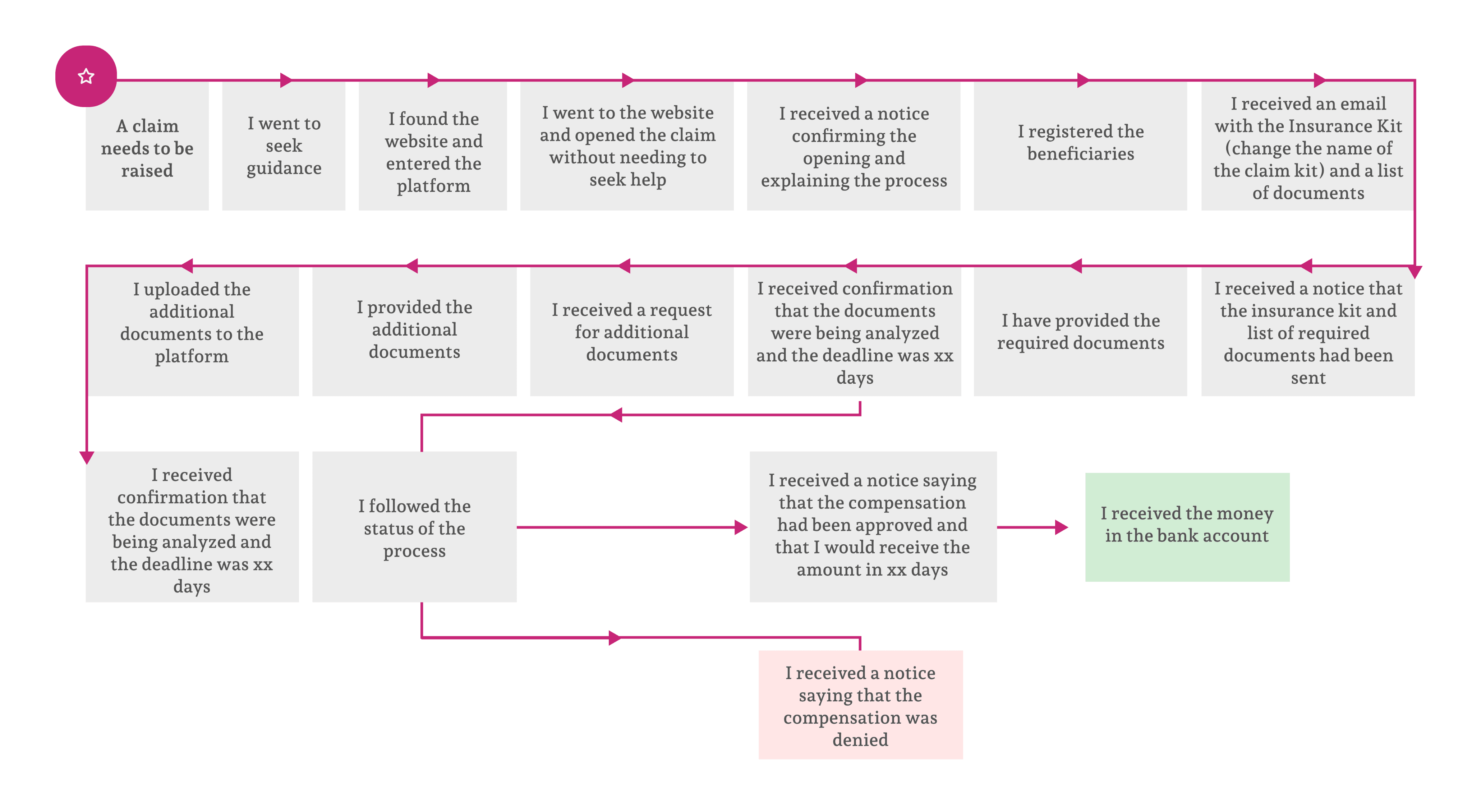
Based on the research we proposed an ideal journey, raising usability requirements for the platform which should be present throughout the entire flow.
Humanized contextualization
As this is a complex subject at a sensitive time, it is more than necessary to make it clear at which stage the user is, what they will need, and how they will do it in a simple way.
Easy language
Technical terms cannot cease to exist throughout the process, but they need to be explained, leaving the user comfortable and safe throughout the journey.
Step-by-step navigation flow
We make it clear how many steps there are and how long each one will take, as well as the documents needed to carry it out, giving control and freedom to the user.
Microcopy and nomenclatures
The small texts that can be seen throughout the journey help the user with visibility, clearer understanding and end up preventing errors and questions.
Access to the platform
The user must have access to all steps performed and the information they filled in, having visibility of the status in the system.
Information architecture
Flow of steps with information organized by priority, making the space more intuitive, functioning as a timeline as if the user were guided to perform one step after another.
Communication and emails
In addition to the movements that can be tracked on the platform, the user receives an email alert for each update.
Profile separation
Throughout the journey, questions are asked to direct which style of communication will be used in the next steps with the user, thus making communication more direct and clear.